Dropbox's Baffling Visual Redesign
I know my blogging efforts have never been about digital or graphic design (insofar as they've ever been about any one topic for more than three weeks or so), but today I want to talk about a story that affects me personally.
I really like Dropbox. It's the one app that I feel actually improves my life in a measurable way. I genuinely think cloud storage is an epoch-making innovation, in that it was the first step towards completely doing away with static, hard media (and never mind that it's so legendarily insecure that I can't use it for any purpose at my IT security job). And now, after years of seeing the comforting blue box on my devices, they've gone and changed how it looks.
Now granted, the old Dropbox aesthetic was kind of aggressively uninteresting, sporting a blue and white look that resembled some sort of default template, but the new, overhauled appearance is baffling in a way that makes me wonder if it's some sort of elaborate trolling attempt. The icon is now enclosed in a circle, something I thought we had universally agreed to leave back in 2014 (you know, all the way back then), and sports a jarring purple and hypothermia-blue colour scheme.
But that's nothing compared to the website. Dear god, the website.
One one hand, I admire a company willing to break completely from the minimalist design language that the internet and tech world has been using since shortly after the turn of the century. There is something bold and even noble about untethering oneself from the shackles of convention, leaping headlong into the uncharted void.
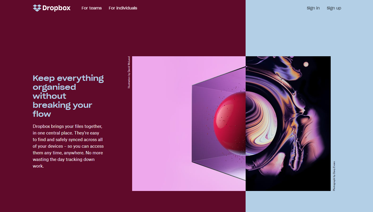
On the other hand, this is what they came up with:
If you told me this was a screenshot of a website from 1998, I'd believe you. Hell, I'd buy that it was from 1988 if I didn't know that there weren't any websites back then. That font, those clashing colours, the...whatever is happening in that image, all combine to activate visual processing components in my brain that haven't fired since the Bondi Blue iMac was on sale. It looks like it came from an alternate timeline where we invented cloud storage in the 90s.
For a while, I've been musing on the fact that the current digital aesthetic will one day go out of fashion and seem ridiculous and quaint, just like the look and feel of products and the internet and advertising from the 90s and early 00s now seem embarrassing and baffling, and I've wondered what trends will be in place in ten years time. What will "modern" look like in 2028?
Apparently, it will look like 1998. Time is an Ouroboros, forever eating its own tail and returning to the ground state of existence, which is a print magazine ad for internet service providers back when 56k modems were the hot new thing.
